Components
The following components satisfied the desired characteristics and fulfil the context of use:
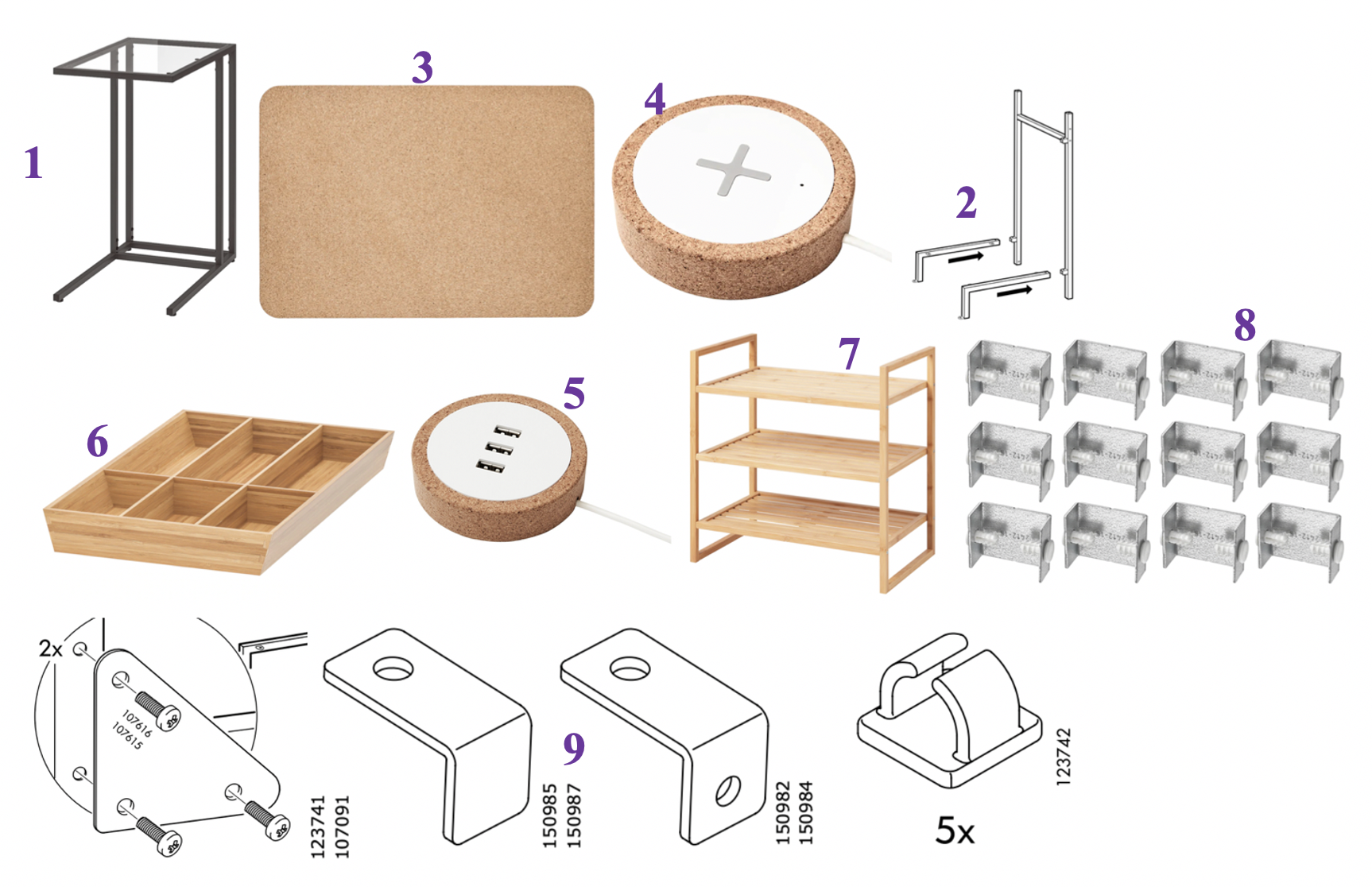
- VITTSJÖ Laptop Stand (W 35cm, D 55cm, H 65cm)
- VITTSJÖ Laptop Table Connection (L ~35cm)
- SUSIG Cork Desk Pad x 2 (L 45cm, W 65cm)
- NORDMÄRKE Wireless charger (H 2cm, D 8.5cm, Cord length: 1.90m)
- NORDMÄRKE USB charger (H 2cm, D 8.5cm, Cord length: 1.90m)
- VARIERA Cutlery tray, bamboo (32x50 cm)
- RÅGRUND Shelving unit, bamboo, (50x50 cm)
- EKET Connection Fittings (12 pack)
- Various Connections

A Study of Components
The main component is an already-existing one - the VITTSJÖ laptop stand.
The glass top in the original VITTSJÖ will be replaced by a number of SUSIG cork desk pads (possibly 2 to 3 depending on the depth of each pad. The beige colour and texture of the SUSIG pads contrast well with the steel frame. This material also hints at progress, study and robustness.
Inserting two NORDMÄRKE wireless phone charging and USB charging components into the pad will add to the desired capability of this design to be a portable, multi-functional desk for the 21st century student. The colours of the components will contrast well with the beige and black of other components.
By including additional sections from the VITTSJÖ laptop table and attaching them to the main frame, I can position the bamboo VARIERA Cutlery tray to sit beneath it as a storage area for stationery, and related items.
A Study of Arrangement
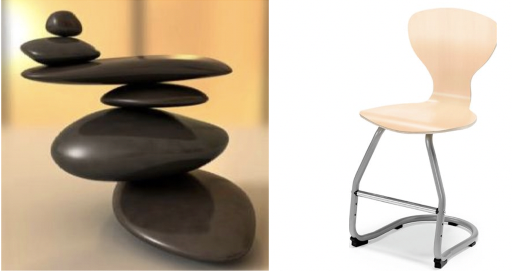
I'm constantly inspired by the notion of "counter-balance" as see in the images below. The S33 chair, in particular, has motivated me in many ways to think about spatial differences. Zen rocks in particular form part of a zen garden which is designed to evoke feelings of tranquillity, calmness and peace; the notion of balance in a frantic and busy world. I find the Plugga chair below, inspired by the S33, suggests a similar vision of balance and strength in a form that might not be initially viewed as such.

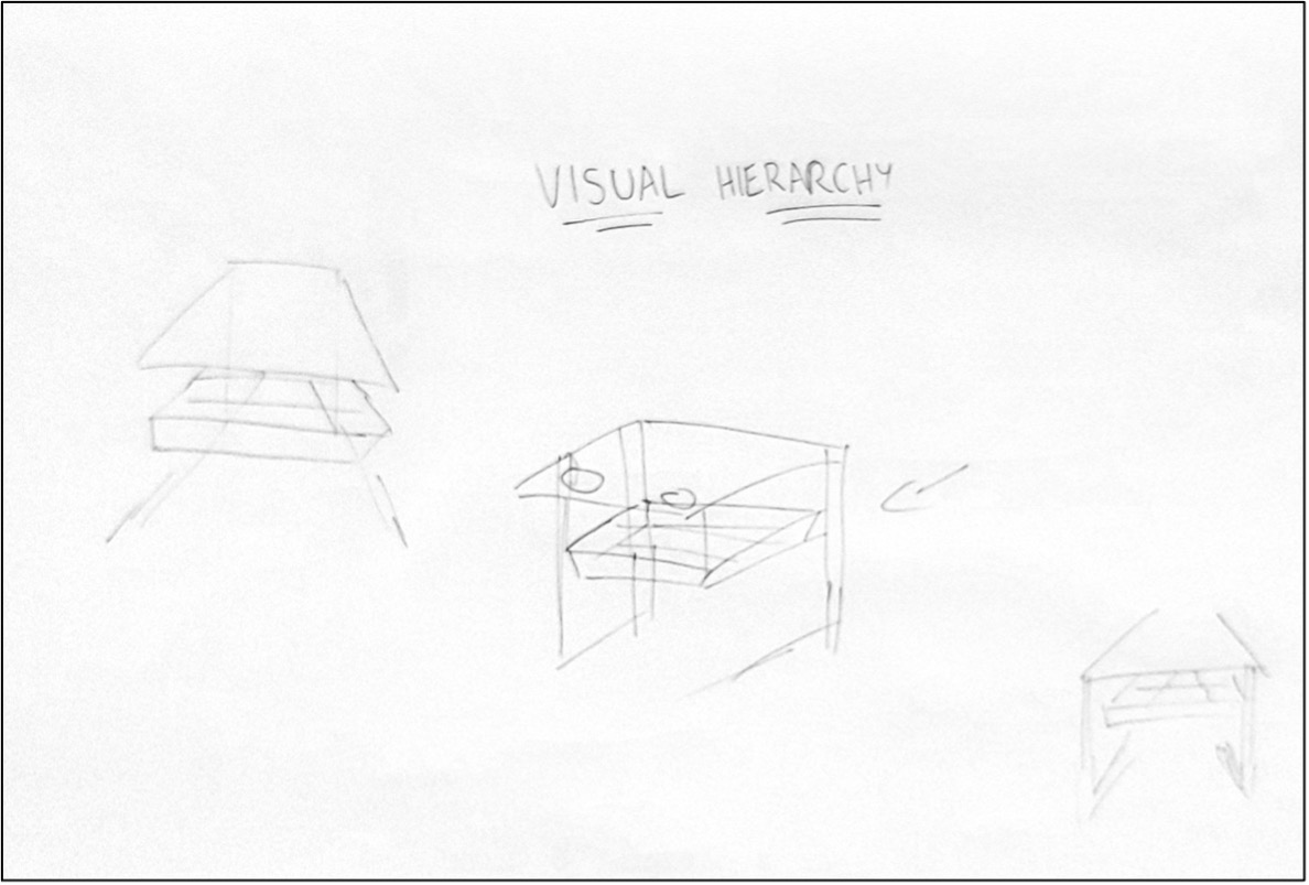
The positioning of the VARIERA tray, which is more pronounced in depth and overall volume suggests that it will form the topmost component in terms of visual hierarchy.
The charging points work well when positioned at the rear of the design, both with regard to focal points and visual hierarchy. Two vertical legs proceed down from the top to the bottom of the VITTSJÖ to provide support. I believe that the charging points will complement this – a suggestion of the rear of the laptop stand being the ‘business end’ where the majority of functionality exists.

