Smart TV Interaction

With the advent of Smart TVs and their associated digital services, coupled with touch technology and its associated design axioms, noticeable interaction differences have arisen between the input and display devices. This project explores opportunities for refinement and improvement of interaction design in this area.

Introduction

This project examines the interplay of search and selection between tv and remote control, proposing alternatives for a simplified and efficient interaction.

This interaction currently utilises the pushing of buttons to choose content or initiate scrolling amongst options on a digital interface. Oftentimes, a substantial amount of memory and recall capabilities are required to achieve desired outcomes, such as remembering channel numbers. Five pages of JVC Smart TV documentation, for example, are dedicated to 27 unique remote-control functions. The experience can be improved, employing recognition rather than recall through alternative sensory cues, such as larger interface elements and a simplified control interface.

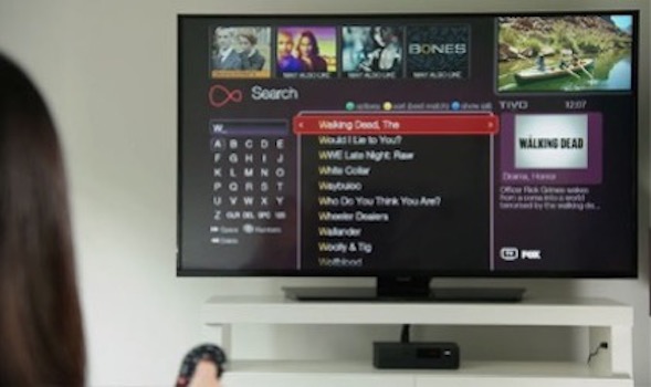
The Virgin Media Digital TV Interface. A lady holds a remote just out of focus.
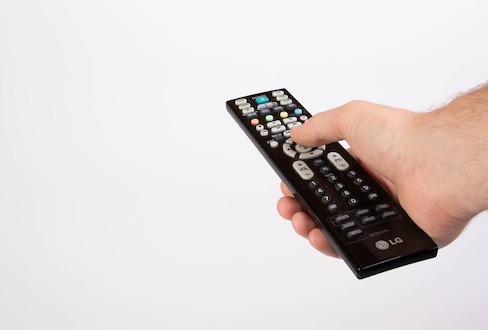
A detail of a hand holding a conventional remote control

Design Context

Users

Studying market segmentation data, I found that smart TV ownership between 2015 and 2018 increased by 15% and accounted for 70% of the global TV market by 2018. [Statista, 2018] This may total US$300 billion by 2027 as per ReportLinker (2020).

The primary users are adults, aged 25 to 44. 46% are well-educated and over 50% are married or living as such. They are also early adopters for new technology. 54% of households with broadband services are also smart tv owners. Children will be regarded as secondary stakeholders. This is supplemented with the evidence that 28% of the primary users are parents.

Activities

Users push / tap on buttons with their thumbs to search and select desired options. A redesigned interface could explore input modalities which include the index fingers. Grip position is an interesting aspect of this interaction. I have observed users having to re-assign focus and attention when manoeuvring their hand(s) to locate the desired button(s). Tasks include scrolling through pre-populated options, selecting and confirming choices. Following this the device may be placed in several locations, on a table, the user’s lap, a sofa etc.

In current designs, the tv displays input information. There is scope to present this in alternative location to help with clarity of feedback.

Environment

Smart TVs are primarily located in domestic settings, particularly in living rooms, kitchens and bedrooms. The environment may be quiet or noisy with many simultaneous activities occurring. Objects within the environment may constrain device operation as may the placement height and lighting levels within the room. Users operate control the tv from either a seated or standing position.


Human Capabilities

Physical

Manual dexterity is relevant to this design problem. The remote control is commonly held in a loose manner and in various positions depending on which buttons are being pressed. It is common for the device to be dropped and any new interactive product should take heed of this in terms of its weight and intended hand position during use. Similarly, any positioning of controls should facilitate easy coordination of hand and finger movements with respect to choosing options and manipulating a digital interface.

Sensory

A redesigned interactive product in this area should take account of the sensory capability of sight. Appropriately contrasting foreground and background colours on the interface controls is of paramount importance. Clear textual labelling, distinct element borders, and ensuring that colour alone is not used as the only means of conveying information must also be considered as must mindful use of well-sized textual labels. Paying attention to these factors will not only assist users with permanent or temporary visual impairments but also those who may experience situational visual obstructions while operating the product in variable lighting conditions.

Cognitive

There is opportunity to address the attention process here. I have observed users having to re-assign focus and attention when manoeuvring their hand(s) to locate the desired button(s) on the controlling device. They then look back at the tv as they push the button to confirm that the action is received by the tv. It is noticeable that focus on the interaction is greatly increased, as is cognitive load. Generally these take the form of brief glances, but in a noisy room where there are many things happening simultaneously, there is potential for the user to lose focus, prolonging the task and potentially creating frustration.

Activity and Environment: Key Aspects

Activity

The supposedly simple activity of ‘search’ is reliant on visible similarities between the input device and the graphical output. Research has demonstrated that conventional remote controls regularly include a wealth of buttons, many of which are seldom used. The intention behind this interactive product is to constrain input options to as few as necessary for the variable tasks required at the time, rather than as many fixed and ubiquitous options as possible.

This leads to the second consideration of the simplicity / complexity of the task. Further research has indicated that owners interact with their smart tv using more than one input device and in a variety of ways. A new interactive product would need to support all of these interactions to lessen the complexity that can arise due to the many possible avenues for interaction.

Environment

Distance between the input device and the tv receiving the input, as well as any potential physical impediments are aspects to consider here. There may also be variable changes in the ‘line of communication’ between the two, such as people walking past the tv. We must also consider the technical aspect of the environment too, such as, for example, if they must both be located in close proximity to any wireless routers in order to function appropriately. Changes in lighting, brought about by seasonal changes and / or time of day can also have an impact of the appearance of the product and may affect how users perceive it in low light etc.

The physical placement of the input device during and after use is an important consideration. Modern technology such as tablets and laptops can overheat if they do not have space to cool. This could potentially be dangerous if the new interactive product includes such features. As such, it should be catered for.

User Research

Justifications

The two methods I chose were the questionnaire and direct observation.

The questionnaire allows me to gain valuable insights into user opinions relating to my design problem. It also provides the opportunity to gather a large amount of data from a broad group of people quickly.

I created an online questionnaire using Google Forms and distributed it to student’s within my tutor group and also to some other contacts in my mailing list. I intended to keep the number of questions to a minimum in order to increase completion rates, and provided some open-ended questions to allow respondents to give opinions. This was particularly useful as it provided information on aspects of the design problem I hadn’t considered to that point. I also made clear that all responses were anonymous.

In the main, this allowed me to gather quantitative data; supplementing assertions discovered earlier in my research. It gave me some insights into user age-ranges, likes / dislikes and smart tv features which are most commonly used.

Direct observation is relevant for my design problem because the very interaction I am examining is one which, although frequently carried out by users, is done so intermittently, often without much thought and with various end-goals in mind. Users may be simply browsing content or searching for something in particular. Therefore, by directly observing users I can take stock of things like certain movements, changes in hand position, body position and indeed what they do with the current interactive product when it is not in use.

I would focus on individuals as they use current devices to search for and choose content, documenting what occurs, user behaviour and any physical aspects of a situation.

Any data collected would be qualitative in nature, obtained by observing users involved in naturalistic interaction.

By collecting and analysing the qualitative and quantitative methods of enquiry above, a more complete understanding of the design context can be established. Taking note of the answers given in the questionnaire, I can be aware of potential issues raised and mindfully watch if similar difficulties arise during indirect observation. The latter can also ‘give voice’ to the opinions put forth in the questionnaire.
Interviewee Identification

I interviewed a forty-one year old female smart tv user. This user is a professional business woman, married with a university degree, is familiar with modern technology and views content on an almost daily basis on her smart tv. She is also a parent of two children. I have chosen this user for interview because I believe she is representative of the primary user target group identified in my earlier paper-based research. My initial intention is that this will be a semi-structured interview. While I will have a number of pre-planned questions, it is entirely possible that other topics revolving around the issue may arise.

I chose to conduct the interview in the living room of the user’s home, where her smart tv is located. Firstly, I want the user to feel comfortable and at ease when answering my questions. Secondly, I believe that engaging in interview in the location where the interaction I am researching takes place may assist in fostering ideas for further discussion during the interview process. Indeed, by physically having the tv remote control to hand may also serve as a prop when thinking about answers. As alluded to earlier, the very interaction I am investigating is one which occurs now and again. In the context of the purpose of a smart tv, searching for content is a means to an end, and the device that facilitates this is perhaps regarded as one of secondary importance in the overall ‘watching television’ story. Any efforts that can be made (like those mentioned above) during the interview to help the interviewee to feel confident in their answers will be fruitful ones.

Sample Interview Questions and Justifications

1. “Can you describe the process you currently carry out to turn on your smart tv and search for what you want to watch?”

I want to understand the basic process the user undertakes in order to achieve their primary goal – that is, to find content. I want to understand how many steps the user must follow in order, to appreciate how simple/complex the activity of finding content is.

2. “Thinking about the remote control(s) you currently use to choose content or make a selection on your smart tv, is there anything you particularly like about it/them?”

The initial survey I conducted informed me that some users use more than one remote for interacting with the tv. This question is intended to allow the interviewee to describe features of the interface that they find useful/aesthetically pleasing, to take note of and possibly include when incorporating during prototyping. I also want to understand if there is a preference for remote control size, should the user possess two devices.

3. “Is there anything you find difficult or challenging when you are selecting content?”

In developing empathy with the user throughout this scenario, this question is intended to recognise any pain points the user has with regard to the activity. Discussing and exploring these issues, and indeed identifying the reasons why the user has these pain points, will be extremely valuable when prototyping my new interactive product.

4. “Which buttons on the remote control do you use most regularly?”

Again, answers to my initial survey raised the point that there are a large number of buttons on conventional remotes that users do not really know the purpose of. As humans are creatures of habit, and also as there are generally a number of different paths which we can usually take to find content on tv (entering numbers / scrolling), I want to uncover which controls the user mainly uses, to understand why they do so, and also why they don’t use others.

5. “How do you hold the remote when you are carrying out this interaction?

This question intends to examine and understand the more physical aspects of this interaction, and any challenges the interviewee experiences. I wish to explore aspects of hand placement, grasp and body position specifically, with a view to identifying any opportunities and also any contextual constraints to consider for a new interactive product.

Interview Results

Two Specific Use Cases

a. The interviewee indicated during interview that they find the interactive motion of scrolling through content using a specific set of directional buttons to be more natural and easier than physically entering information using numerical or alphabetical buttons. However they did point out that the ability to enter this information is necessary at times.

Therefore, the following scenario captures this use case:

“When I turn on my smart tv, I want to be able to use descriptive and familiar controls to navigate around the interface, so that I can find what I want quickly and easily.”

b. The interviewee uses the remote control with one hand almost exclusively. The layout of the interface means that if they want to push buttons located at the top or the bottom, they must loosen their grip and let the remote slide down (to get access to the upper portion) or push the remote off their body while loosening their grip, to move their hand to the lower portion of the device. This leads to the remote being dropped quite frequently, which can have negative affects on its functionality, and arguments amongst family members!

Therefore, the scenario arises in the following use case statement:

“I require input controls to be situated in areas that are easy to locate quickly when I am choosing content, to minimise risk of dropping it.”

Requirements

The product is physically constructed in a way that promotes comfort and confidence when holding and inputting information.

Much time was spent comparing the two remotes the interviewee uses, which they prefer over the other and why that is. Button positioning, length and weight were referred to as areas of importance for them. This requirement is probably the most important of the three I have identified. If a user finds a product uncomfortable to use, which leads to a bad user experience, then this can seriously impact the return on investment. Considering the situation and environment for the primary interaction, the interviewee mentioned that pointing the device away from the body is less comfortable than holding it close to their torso and focusing on it.

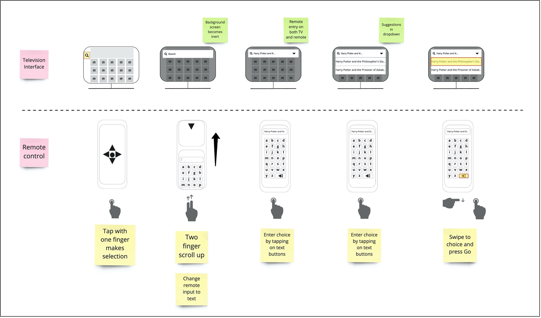
The products includes a graphical user interface with a QWERTY-style keyboard.

The interviewee indicated that they “hate using the [alphanumeric] buttons to type” on their current remote control. They also spoke about how using the directional buttons is “a bit easier” but said “it would be great if there was some type of functionality to tap on a small screen like a phone keyboard.” I believe this to potentially be the main selling point of my new product. Innovative opportunity exists in a device that offers flexibility for interaction by comprising both a tactile and familiar graphical interface.

Tactile buttons on the product are spaced appropriately apart and can be easily differentiated from each other by sight and touch.

The interviewee commented on how she found the buttons on her games console controller to be much more intuitive. The visibility of the buttons and the ease of learnability were the main reasons stated for this opinion.

Questions to further explore requirements

In relation to the first requirement above, the following questions can be asked:

“When you are interacting with your smart tv, in what physical position do you feel most comfortable?”

I want to further explore the aspect of proprioception and the position of the upper limb used for interaction. Answers to this question will inform product decisions regarding size, weight and button positioning.

“Thinking about other interactive devices you use as well as your remote control, what features of product would make you feel more confident when holding it?”

I am interested in any opinions the user has regarding different devices, why they feel confident holding them (weight?, shape?) to investigate whether there are specific attributes of these products that might be incorporated into a new product specifically for this project.

Conceptual Model

The Overall Concept

A product that simplifies the interaction design model with relation to searching for and choosing content. This will be accomplished by constraining the available options to specific contexts, through the use of the graphical card pattern.

The Anticipated Environment

The environment of use is any location in which a Smart TV is situated. However, the primary environment, based on research, will be the sitting room / living room within the family home. The dimensions of such room vary (House Plans Helper, 2021), and as such, my interactive product will aim to be operational up to and including 5 metres from the TV.

Objects and Concepts

The interactive product will work with a Smart TV. The interface design aims to support the activity referred to in “The Overall Concept” by closely matching the structure presented by the Smart TV GUI. While conventional remote controls transmit information via infra-red or radio frequency technology, a WiFi network will be necessary for my interactive product.

Actions

My interactive product will aim to control the Smart TV it is connected to. This includes turning the TV on and off, changing interface settings, inputting alphanumeric information and navigating through the available options presented on the TV screen.

User Experience

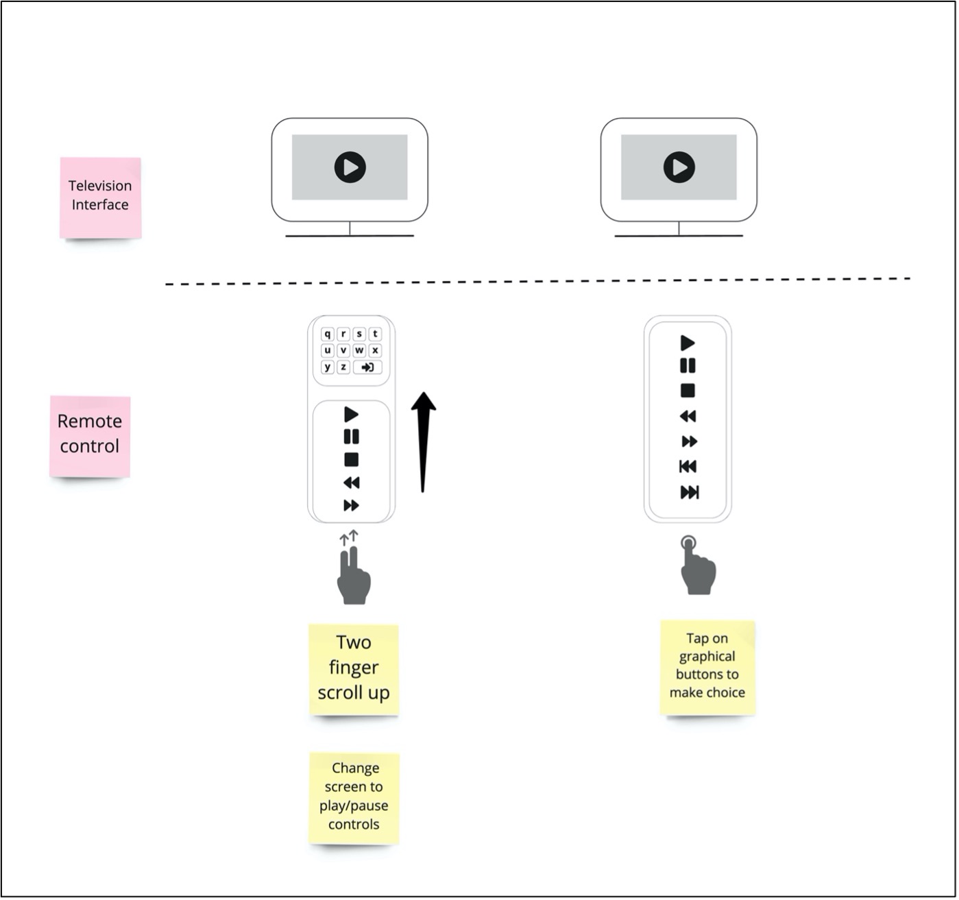
The user experience I want to support are mainly aesthetic fulfilment and operational satisfaction. I will aim to accomplish this through the use of graphical cards. The primary interactions a conventional remote control provides, will be organised into simplified groups, thereby surfacing content and actions for specific contexts.

Interface types

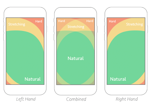
The mobile interface has been chosen for my interactive product. More specifically, the interface will be situated on a dedicated hardware device of size between that of an iPhone and an Amazon Kindle Fire. This will allow the user to either hold and interact with the interface with the digits of one hand , both hands or, if required, position the device in their less dominant hand and carry out interactive gestures, similar to those associated with current touch technology. This refers back to one of the user requirements already identified and the feeling of confidence during use.

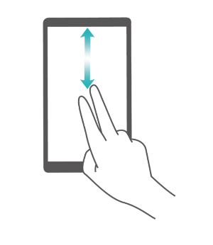
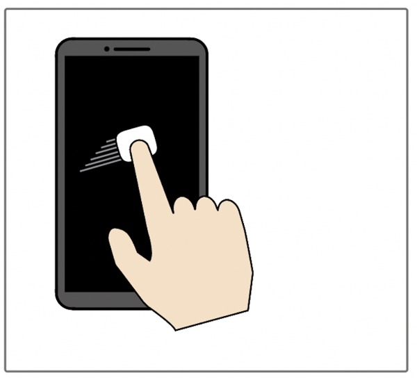
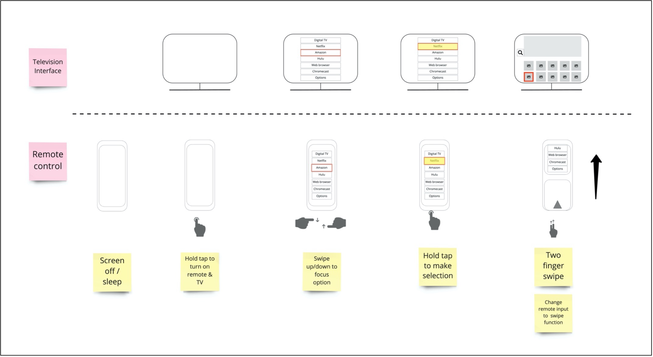
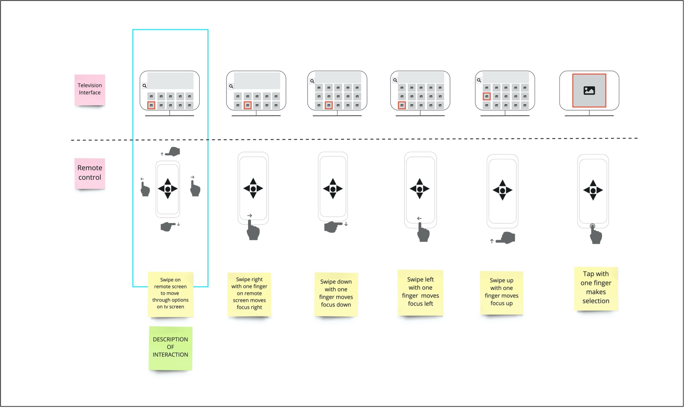
The interactive product will utilise intuitive gestures that have been established on modern day touch devices, while also harnessing the power of ‘two-finger vertical swipe’, similar to the gesture used by blind and visually impaired users to scroll through cards and app screens when using a screen reader. (Nielsen Norman Group, 2015). I have particularly paid attention to the interaction pattern provided by the Talkback screen reader on Android mobile devices (Huawei.com, 2021) to guide my thought process here.

Two fingered swipe interaction on mobile devicres
Detailed diagrams of natural thumb positioning depending on dominant hand interaction or via two-handed interaction.

It is foreseen that Interactions on the control device (the remote) will be sensed automatically and transmitted to the display device (the tv).

Scenario Storyboard

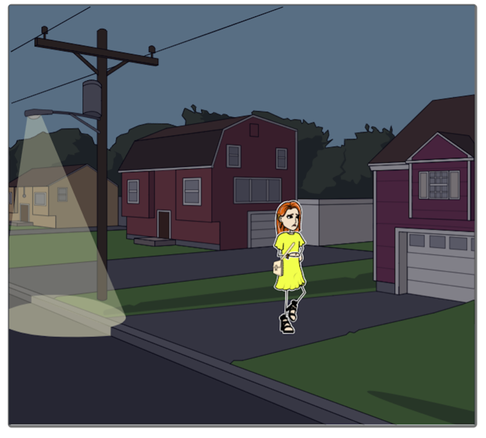
Character returning home to her home from work. She looks tired. 1. Karen returns home from a long day at the office.
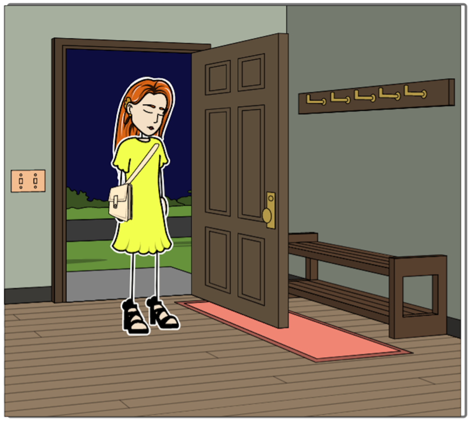
Character enters her home. 2. She enters her home and emits a tired sigh. Running a successful business can be mentally draining. All she wants to do now is relax.
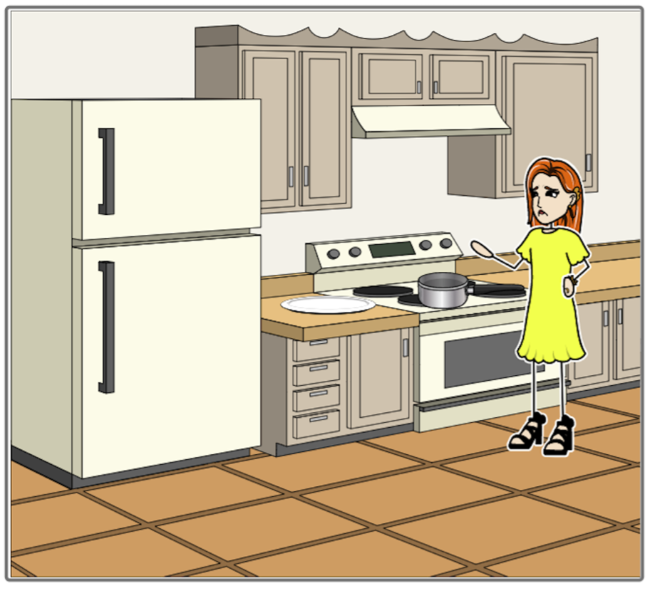
3. As she prepares here evening meal, the thoughts and struggles of the day remain with her.
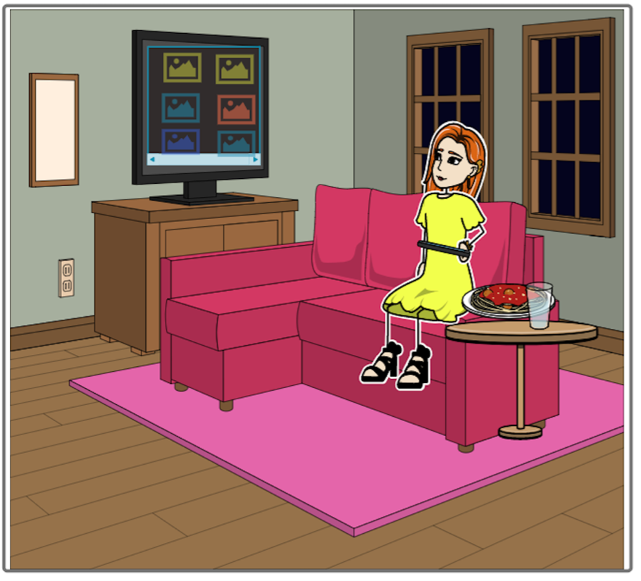
4. Taking her meal to her living room, Karen wishes to relax in front of the tv and relax.
5. Using her new touch-based remote, Karen can manouvere around the interface using a familiar 'tap and swipe' interaction, while not having to change visual focus from remote to tv and back again.
6. The new remote allows her to quickly scroll through choices and make quick decisions. She can now relax and enjoy her evening.

Prototyping